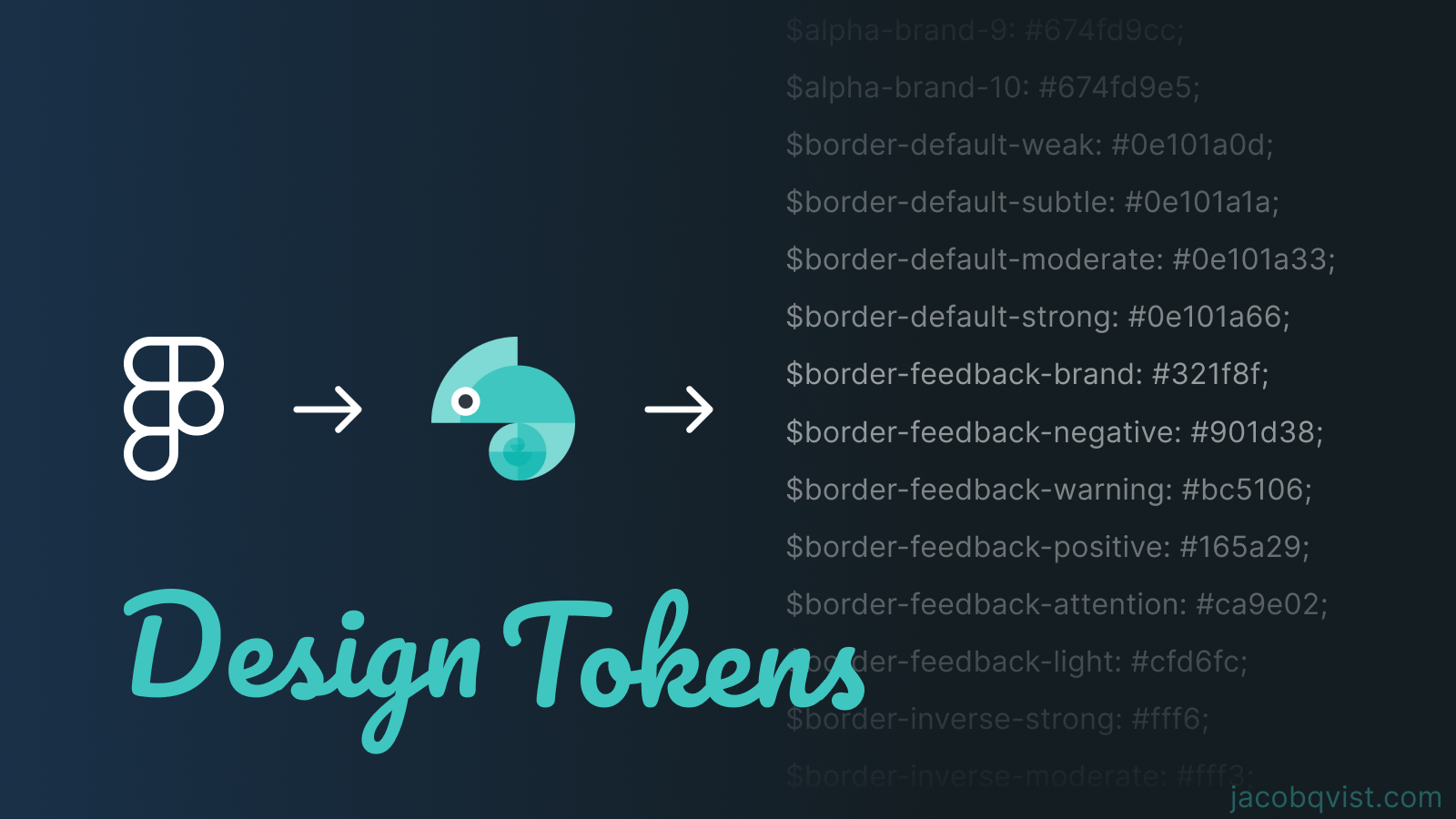
Seamlessly Integrating Figma Design Tokens Across Multiple Platforms with Style Dictionary
What are design tokens?
Imagine you’re a chef, and instead of rummaging through your pantry for every spice every time you cook, you have a magical spice rack that automatically refills and updates itself. That’s what moving from hardcoded styles to design tokens feels like for developers and designers. Adobe puts it elegantly:
Design tokens — or tokens, for short — are design decisions, translated into data. They’re ultimately a communication tool: a shared language between design and engineering for communicating detailed information about how to build user interfaces [1].
So, when a designer decides to switch up the color palette faster than a chameleon at a disco, developers don’t have to embark on a digital scavenger hunt through the codebase. Instead, they write a custom parser once that transforms the JSON based tokens, and voilà, the changes propagate everywhere. It’s like having a stylist for your app who ensures everything matches perfectly without you lifting a finger. Or actually… You will have to commit and push all new styles every time the stylist changes the look 💅
Design tokens are named in a way that reflects their purpose and context within the application. For instance, tokens such as background-primary-strong, border-feedback-brand, and brand-8 serve as intuitive identifiers for design properties. In our codebase, brand-8 functions as the foundational token, with other tokens acting as aliases derived from it. This aliasing system simplifies the design process by facilitating the reuse of design properties. When generating cascading style sheets, instead of creating direct links between colors, Style Dictionary generates three distinct variables. This approach ensures a modular and maintainable structure in the stylesheet, streamlining the design-to-development workflow and enhancing consistency across the user interface.
Benefits from using Design Tokens
- Maintainability. Way easier to sync design changes into the codebase.
- Creates a common language between designers and engineers.
- Can be exported to many different programming languages.
- If you want to change from px to rem, you can change your parser and then all the tokens can be changed. Also, if you want to adopt a new color format that can also be done, but at the time of writing this, the cool new color formats are not supported in Figma.
How to sync the codebase with the latest design system?
In our codebase, we’ve adopted a modular architecture that allows standalone, buildable libraries to be shared across different applications, including their styling. This modular approach ensures reusability and consistency across our projects. Here’s how we integrate design tokens into this architecture:
- Install Style Dictionary with your favorite package manager.
- Loading JSON Tokens: We begin by importing JSON tokens into our codebase, placing them in a designated folder named _raw-tokens. This folder acts as the central repository for our design decisions, encapsulating values like colors, spacings, and typography.
- Generating SCSS: To convert these JSON tokens into usable SCSS variables, we execute the command
yarn generate:design-tokens. This command triggers a Node.js script equipped with a custom parser. Our parser leverages a configuration file, sd.config.json, to determine the styles that need to be generated. This setup is incredibly versatile, allowing us to simultaneously generate tokens for various platforms such as Android, iOS, Flutter, SCSS, and CSS. This capability is particularly beneficial for large-scale projects with multi-platform requirements. - Compilation Check: After generating the SCSS variables, it’s crucial to verify that the application compiles successfully. Opting for SCSS variables enables us to catch compile-time errors, such as missing variables, ensuring a smoother development process. This structured approach to handling design tokens not only streamlines the development workflow but also bridges the gap between design and engineering teams, fostering a more collaborative and efficient environment.
Implementation
As earlier explained, we decided to write a custom parser in node, but that is not necessary for all projects. The problem that we faced was invalid style generation. Some of the variables became [Object object], which is because these were composite tokens. We tried and succeeded in writing a parse that did parse each of these into seperate variables, but decided to create these manually. Our chief designer said:“These are probably not going to change anyway”. But we are still looking forward to support for composite tokens.
Custom parser
const StyleDictionary = require('style-dictionary');

StyleDictionary.registerTransform({
	name: 'size/pxToRem',
  type: 'value',
  matcher: function (prop) {
		// This will apply the transform only to properties that have 'px' in their value
    return prop.value.includes('px');
  },
  transformer: function (prop) {
		const baseFontSize = 16;
    const value = parseFloat(prop.value.replace('px', ''));
    return `${value / baseFontSize}rem`; // Convert px to rem and return the new value
  },
});

// Register a custom parser
StyleDictionary.registerParser({
	pattern: /.json$/,
  parse: ({ contents, filePath }) => {
		if (
			filePath.endsWith('color.styles.tokens.json') ||
      filePath.endsWith('effect.styles.tokens.json') ||
      filePath.endsWith('text.styles.tokens.json')
    ) {
			return null;
    }

    const tokens = JSON.parse(contents);

    // Function to recursively transform token object keys
    function transformTokens(obj) {
			const transformed = {};

      for (let key in obj) {
        const newKey = key.replace(/^$/, ''); // Remove $ prefix
        if (typeof obj[key] === 'object' && obj[key] !== null) {
          transformed[newKey] = transformTokens(obj[key]);
        } else {
					// Copy the value as-is
          transformed[newKey] = obj[key];
        }
      }

      return transformed;
    }

    const transformedTokens = transformTokens(tokens);

    return transformedTokens;
  },
});

// Extend Style Dictionary with your configuration
const styleDictionary = StyleDictionary.extend('libs/super-shared/design-tokens/tokens-config.json');

styleDictionary.buildAllPlatforms();
Token configuration file
{
  "source": ["libs/super-shared/design-tokens/raw-tokens/*.json"],
  "platforms": {
    "scss": {
      "transformGroup": "scss",
      "buildPath": "libs/super-shared/design-tokens/generated/",
      "transforms": ["attribute/cti", "name/cti/kebab", "size/pxToRem", "color/css"],
      "files": [
        {
          "destination": "_consts.scss",
          "format": "scss/variables"
        }
      ]
    },
    "css": {
      "transformGroup": "css",
      "buildPath": "libs/super-shared/design-tokens/generated/",
      "transforms": ["attribute/cti", "name/cti/kebab", "size/pxToRem", "color/css"],
      "files": [
        {
          "destination": "variables.css",
          "format": "css/variables"
        }
      ]
    }
  }
}
Conclusion
In conclusion, the adoption of design tokens and the utilization of Style Dictionary represent a significant leap forward in the pursuit of design consistency and efficiency. As we continue to navigate the complexities of multi-platform development, the principles and practices discussed here will serve as a beacon, guiding us toward more integrated, collaborative, and scalable design systems.